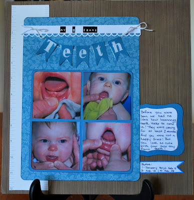
I chose to do a grid so the photos would easily show progression. I marked them with the numbers 1 through 4 and coordinated those numbers with the dates. I rounded and inked the outer corners of the photos, the solid card stock mat and the patterned paper to give them depth.
After I put the layout together my husband said it reminded him of a dentist office. That was not my intention, but it's pretty cool that the patterns do in fact look like wallpaper you might see in a dentist office!

The title is my favorite part of this layout! I used tiny letter stickers for the first part because I thought they looked a bit like Jack-o-Lantern teeth. For the word Teeth I cut 5 banners, added die-cut letters, then covered the pieces with Glossy Accents. When it dried it had a hard, shiny coating...like tooth enamel!
Now my daughter is working on teeth three through six, all at the same time! Not as exciting the second time around! But at least we know what to expect.
Well, be back tomorrow! Thanks for stopping by.


No comments:
Post a Comment